
STREET-LEVEL TYPOGRAPHY
Isa Zapata ·
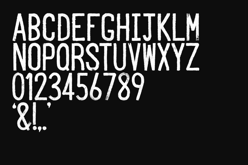
O Street designs a unique typeface inspired by road markings, blending handcrafted techniques with digital editing to create a distinctive corporate identity.
Privacy and analytics
We use necessary technical cookies and, only with your consent, analytics and marketing pixels to improve the website and measure campaigns.
Isa Zapata ·
O Street designs a unique typeface inspired by road markings, blending handcrafted techniques with digital editing to create a distinctive corporate identity.

What do you need to create a typeface? Grab paper and pencil; and take note:
What is the process?
1. On the road and guided by a ruler, use yellow chalk to paint the blocks where each of the letters that make up the alphabet will be located. These must have the same width and height.
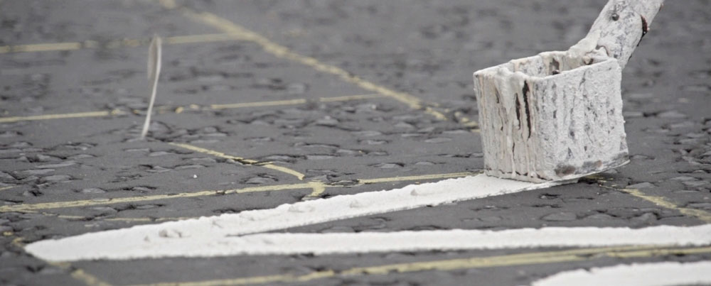
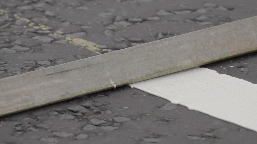
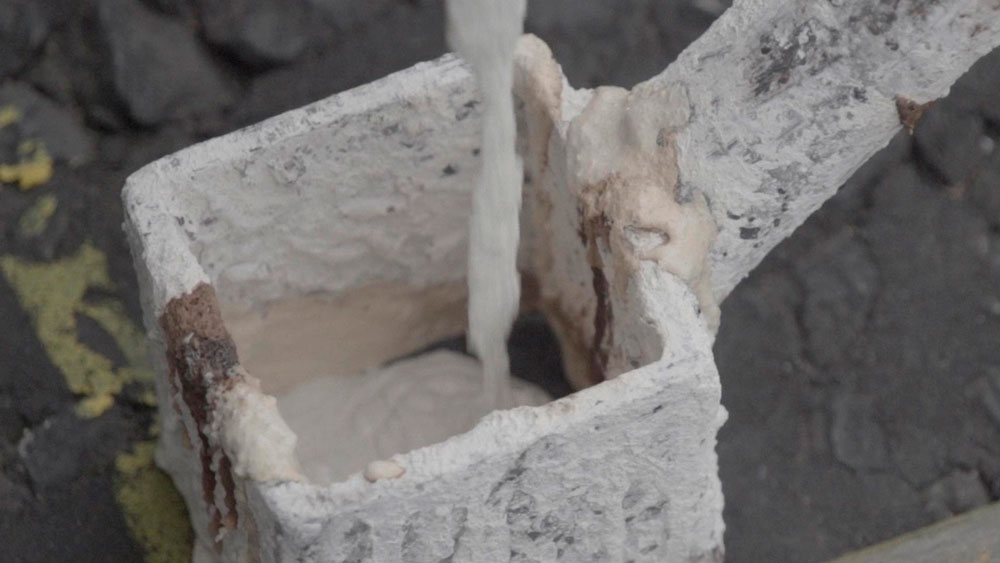
2. Using a somewhat artisanal tool, made of a pole attached at one of its ends to a bucket with a hollow interior, pour white paint for the letters and yellow paint for the numbers and symbols into it. This instrument will be responsible for bringing the typography to life. To this, add your own craftsmanship and precision…
And voilà!
We have created the typography
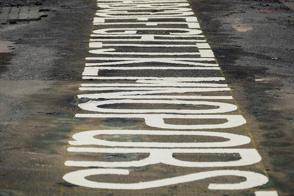
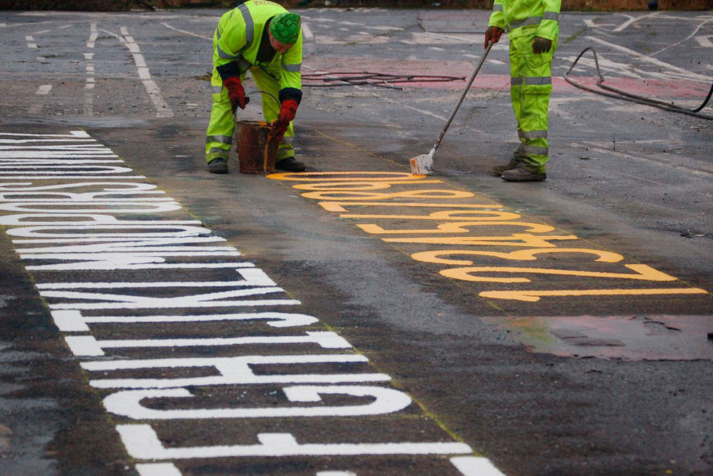
No, we haven't gone crazy, and neither have they.
O Street is a digital marketing and graphic design agency based in Glasgow and London that creates its own typography for its brand and corporate identity, inspired by the strokes, colors, symbols, and letters that customize the roads. This is the concept it is based on, which alludes to its naming.
To carry it out, they use the same rudimentary creation process fused with the digital.
Once the entire alphabet is created, including symbols and numbers, they photograph each of these elements. Next, they add a bit of Photoshop magic without losing its artisanal essence and texture.
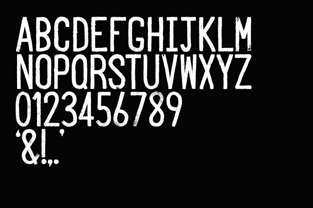
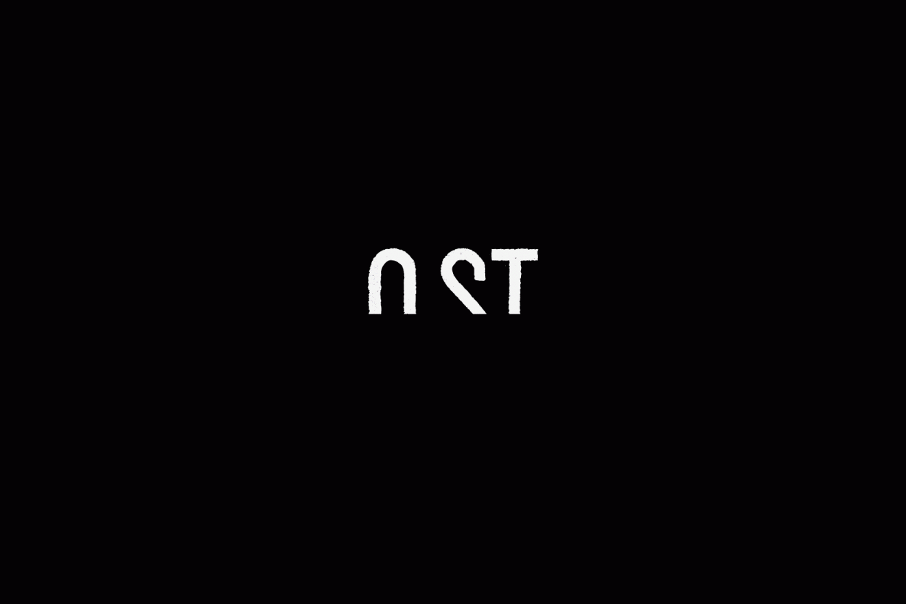
This entire process is captured in a short documentary called Roadliner “Typographers of the road” by Pretend Lovers.
Roadliners – Short Documentary from Pretend Lovers on Vimeo.
The colors that star in their corporate identity are gray (with a greater or lesser percentage of black) and yellow. Symmetry plays an important role when laying out their stationery, making use of columns in their A4s, business cards, envelopes... In all of them, the texture of the typography is carefully maintained, simulating road paint.
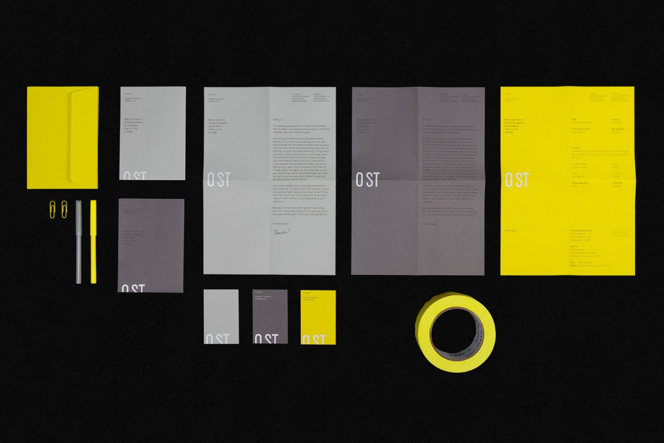
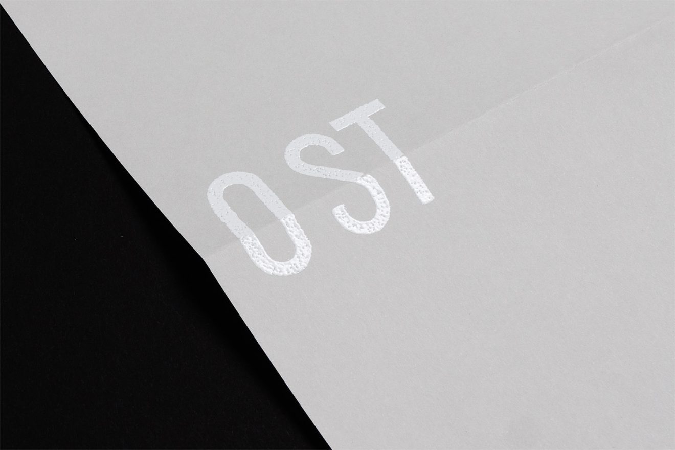
A surprising project that, apart from adding personality to the O Street brand, has a very interesting execution. It doesn't just start with digitizing the brand; there is a quite laborious process behind it to reach the concept they want to convey. Perhaps that is why it is a reflection of the work we encounter daily in a graphic digital marketing and advertising agency. There is always an artisanal part that leads to the digital; and from the digital to its final result, printing.