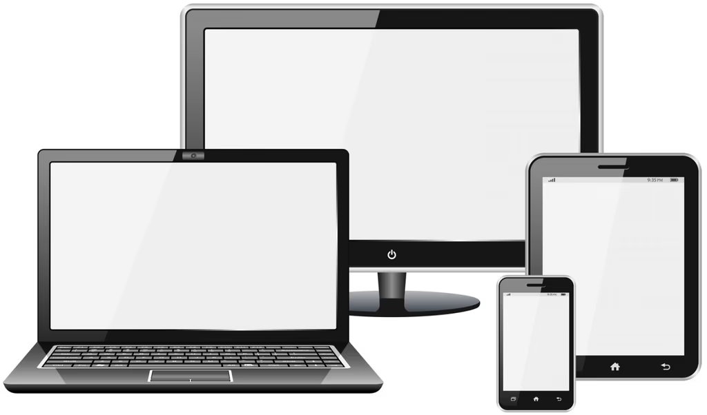
Responsive design is a web design technique that allows the same page to adapt to different devices. It involves resizing web elements to fit the width of each device, allowing for proper viewing, and uses CSS3 media-queries. Once understood, do you think it is a strategy or a necessity?
Today, 80% of web page access happens via mobile devices. What happens when you visit a page and it doesn't adapt to mobile, images look doubled, or you can't find the section you're looking for because it has shifted?
If you experience all this on a page you've visited, it lacks responsive design. The technique has a series of virtues that, at Nömad, make it necessary rather than strategic:
- Reduces development time
- Prevents duplicate content
- Increases content virality
- Improves user experience
Undoubtedly, responsive design can double or even triple the time spent on your page, as well as the visits to it.